The 15 Most Popular Fonts for Landing Pages
One of the most important aspects of any design process is the search for the correct font to create a beautiful user interface! A landing page, as well as a website or even an application, is composed of 70/80% text, so, as you can imagine, choosing the right font can make a big difference in the outcome of your design.
Now, you’re probably wondering: How do I choose the right font for my landing page? What are the rules I must follow to avoid choosing the wrong font and compromising the quality of my design? These are legitimate questions, and in this list, we will suggest three aspects to keep in mind when choosing a font for your landing page, as well as a list of the 15 most popular fonts for landing pages, with specific instructions on how and when to use them.
The list of the most popular fonts comes from our gallery of landing page design inspiration, while the suggestions come from years of experience designing and reviewing landing pages.
Three key aspects to keep in mind when choosing a font for your landing page
Brand consistency: One of the most common mistakes that expert (and non-experienced) web designers make when choosing a font for their landing pages is selecting a particular font without considering its relevance to the product’s identity. The font should match the look and feel of a product and not contrast it. So before choosing a font, you should ask yourself: Is this font relevant to the brand identity? For example: If you are designing a landing page for modern software, it might be best to exclude any Serif font as they are generally more suitable for corporate and classic product websites.
Type of content: When selecting a font for your landing page, it’s crucial to take into account the type of content it will accommodate. If the layouts have minimal text, you can explore more unconventional font choices. However, if the majority of your layouts rely heavily on textual elements, it’s advisable to go for a clean sans-serif font like Inter or Helvetica. This will ensure that your content is clear and flows seamlessly.
Font features: The last aspect (but not the least important) to consider when choosing a font for a landing page is the features the font offers, keeping in mind the present and future content needs. Whenever possible, it is a good rule to choose a font that supports an adequate number of styles/weights (10+), and glyphs, and has support for multiple languages (even if your site is not multilingual).
15 most popular fonts for landing pages
1. Inter
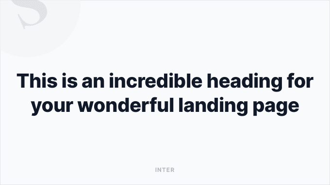
Inter is without a doubt the most popular San Serif font in the world right now. Its versatility makes it suitable for any type of product, and its flexibility makes it the ideal solution for landing pages with a large amount of text.
- Type: Free
- Where to download: Google Fonts
- Use it for: Any type of product
- Companies using this font: Notion, Vercel, and more.
2. Graphik
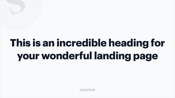
Graphik is a popular San Serif font used by various tech companies. Although its popularity has slightly declined in recent years, Graphik remains a reliable choice if you are creating a landing page for a software startup and the layouts feature considerable amounts of text.
- Type: Premium
- Where to buy: type.today
- Use it for: Software and modern startups
- Companies using this font: Webflow, Marvel, and more.
3. Roobert
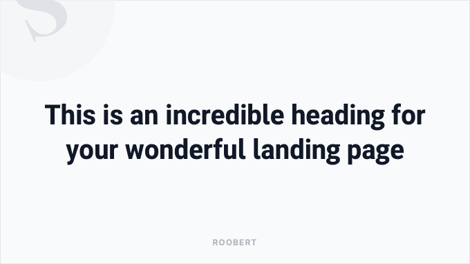
Roobert is a San Serif typeface that has been gaining popularity in recent years, especially within the design community. It’s not as versatile as other fonts but works well for headings thanks to its sharp and distinctive curves.
- Type: Premium
- Where to buy: Displaay
- Use it for: Contemporary and tech startups
- Companies using this font: Evervault, Nuxt, and more.
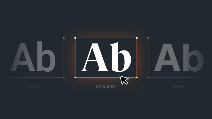
4. GT Super
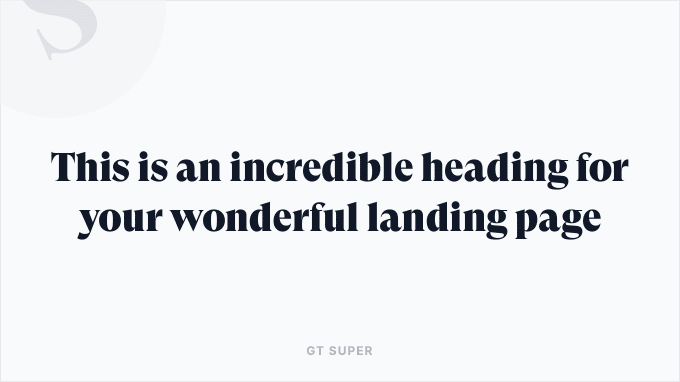
Gt Super is a fantastic Serif typeface that works well on both modern layouts and corporate-style landing pages. It’s meant to be used for headings, paired with a classic San Serif font (e.g., Inter).
- Type: Premium
- Where to buy: Grilli Type
- Use it for: Any type of product
- Companies using this font: WeTransfer, SaaS Interface, and more.
5. Circular Std
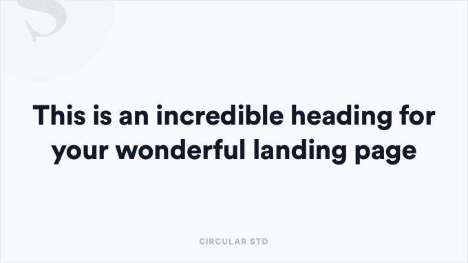
There have been years when Circular Std was the font to use to create a modern and compelling landing page. Unfortunately, the years of its popularity are now over, but it remains a very reliable typeface if you need to construct a simple and sincere design.
- Type: Premium
- Where to buy: Lineto
- Use it for: Simple and classic layouts
- Companies using this font: Lemon Squeezy, Buy Me a Coffee, and more.
6. GT Walsheim Pro
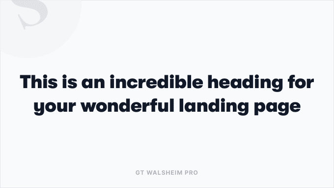
GT Walsheim Pro is a typeface with a strong character that works well for layouts with eccentric and visually prosperous designs. Honestly, we don’t idolise this typeface, but we recognise that if used well, it can bring great personality to any product.
- Type: Premium
- Where to buy: Grilli Type
- Use it for: Eccentric and rich designs
- Companies using this font: Homerun, Skillshare, and more
7. Poppins
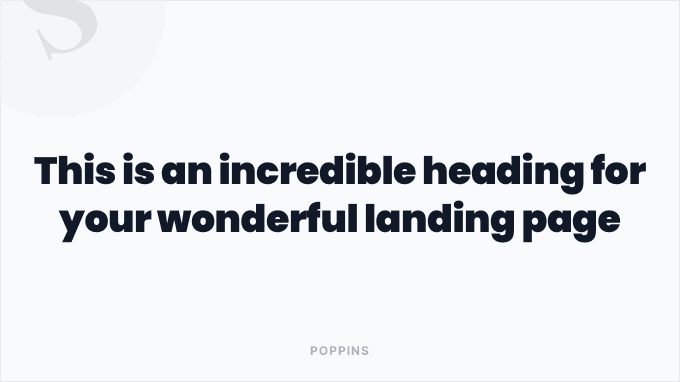
Okay, let’s get it straight: We don’t like this typeface, and we don’t consider it on par with other San Serif fonts included in this list. That being said, we acknowledge its popularity, and we suggest it for bold designs.
- Type: Free
- Where to buy: Google Fonts
- Use it for: Bold and prosperous designs
- Companies using this font: Buffer, SavvyCal, and more
8. Helvetica Neue
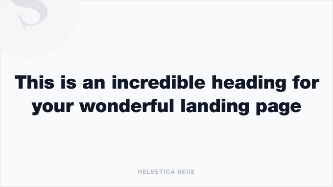
Let’s be clear, who doesn’t know Helvetica? It is undoubtedly the most iconic font ever created, and in its revised version ‘Neue’, it has regained charm and admirers in the design world. This San Serif can be used for any type of landing page, and as the motto teaches: “When in doubt, choose Helvetica.”
- Type: Premium
- Where to buy: MyFonts
- Use it for: Any type of product
- Companies using this font: Vimeo, Feedly, and more
9. GT America
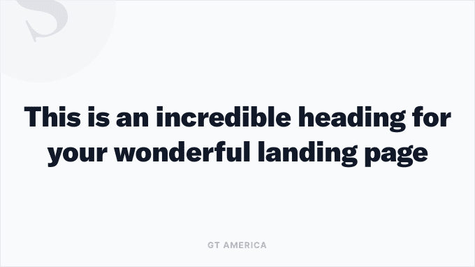
GT America is a San Serif typeface that belongs to the GT family by Grilli Type (see GT Super at the top of this list). It is a very elegant font that can be used for both headings and paragraph content on modern and bold landing pages.
- Type: Premium
- Where to buy: Grilli Type
- Use it for: Bold and modern products
- Companies using this font: Vimeo, Feedly, and more
10. Tiempos Headline
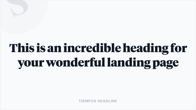
Tiempos is the second Serif font included in this list, and in terms of popularity, it is absolutely a typeface with a rich history. We mainly recommend it for headings, and in combination with a classic San Serif font for paragraphs.
- Type: Premium
- Where to buy: Klim Type Foundry
- Use it for: Corporate and classy products
- Companies using this font: QuestionScout, Twist, and more
11. Basier Circle
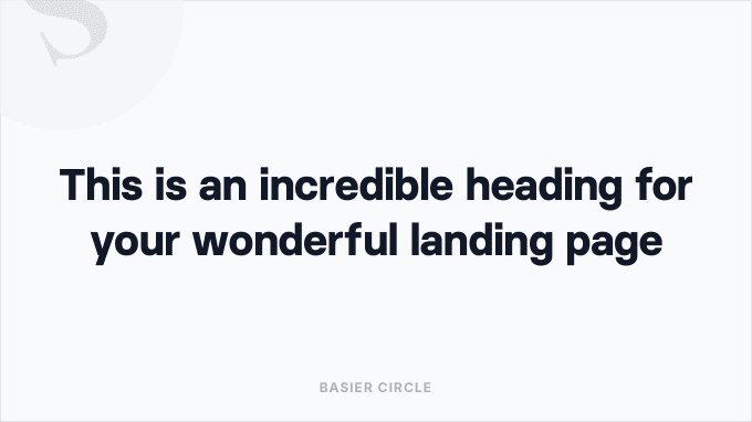
Basier Circle is a typeface with a bold character that works well for both headings and paragraphs, providing clarity of content. It is a highly versatile font that can be adapted for any tech-based product, such as neo banks, design tools, and more.
- Type: Premium
- Where to buy: Atipo Foundry
- Use it for: Tech-based product and apps
- Companies using this font: Revolut, Programmai, and more
12. Recoleta
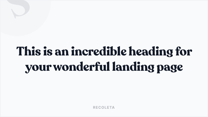
Recoleta is the third and final Serif font included in this list. It is a curvy, soft typeface that works well for bold headings and products with a delicate and “sincere” character.
- Type: Premium
- Where to buy: MyFonts
- Use it for: Classy and delicate products
- Companies using this font: Bruno, Yousign, and more
13. Formular
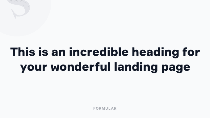
Formular is a San Serif font with curved and imprecise shapes that immediately catch the eye, giving great character to any heading. It is a very unusual font that we suggest in combination with a cleaner typeface for paragraphs.
- Type: Premium
- Where to buy: MyFonts
- Use it for: Products with a great character
- Companies using this font: Miro, and FlowMapp
14. Apercu Pro
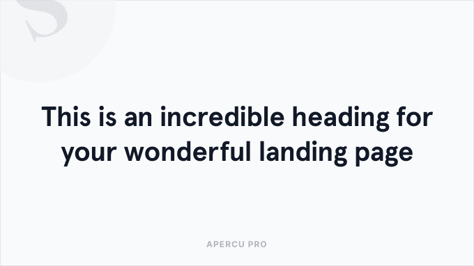
Apercu Pro is a font with large and airy letters that works well for headings of a certain size (80px and above). With its imprecise and irregular curves, we recommend using this typeface for landing pages with a strong character.
- Type: Premium
- Where to buy: Colophon Foundry
- Use it for: Products with a strong personality
- Companies using this font: Typeform
15. Plus Jakarta Sans
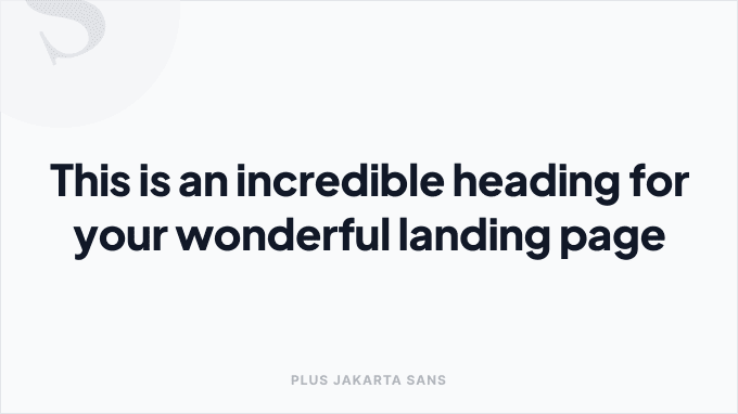
The last font on this list is an open-source typeface called Plus Jakarta Sans (also available as Google Fonts). It is an unpretentious San Serif that works well in contexts with a simple design and not overly complex layouts.
- Type: Free
- Where to buy: Google Fonts
- Use it for: Simple and clean layouts
- Companies using this font: Dovetail, Whimsical, and more
Bonus section: 3 font combination ideas that will make your design pop
We kept this bonus section as a final surprise to show you how to combine some of the fonts mentioned in the list to create spectacular font combinations. For the three examples, we’ll start with a Sans Serif as the base typography and play around with three different typefaces for the headings:
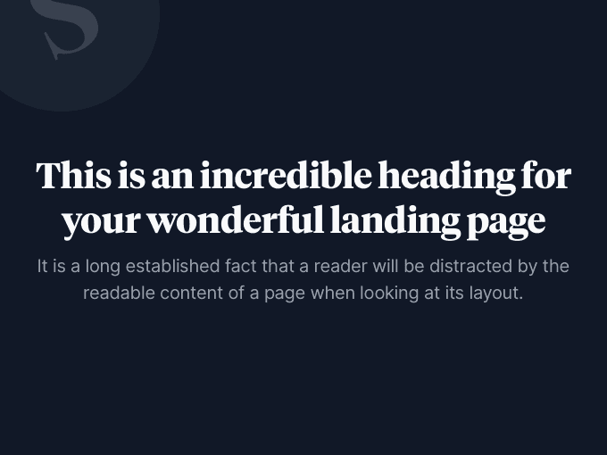
1. GT Super + GT America
For this first font combination, we want to propose a combo from the GT family that includes a Serif and a San Serif. The versatility of these typefaces will allow you to create numerous interesting combinations, especially for headings.
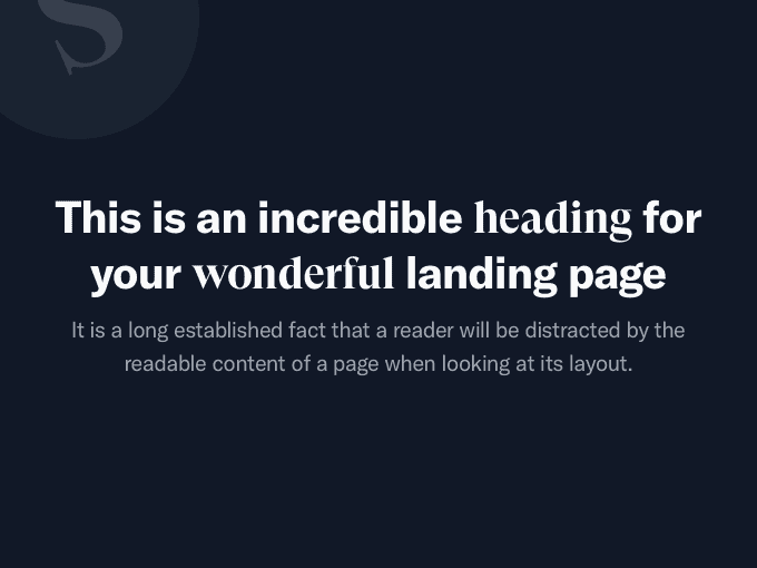
2. Tiempos Headline + Inter
For this second combination, we suggest a classic pairing: a serif typeface for headings and a sans-serif typeface for paragraphs. This combo can be used in any situation and will provide you with classy and captivating typography.
3. Apercu Pro + Circular Std
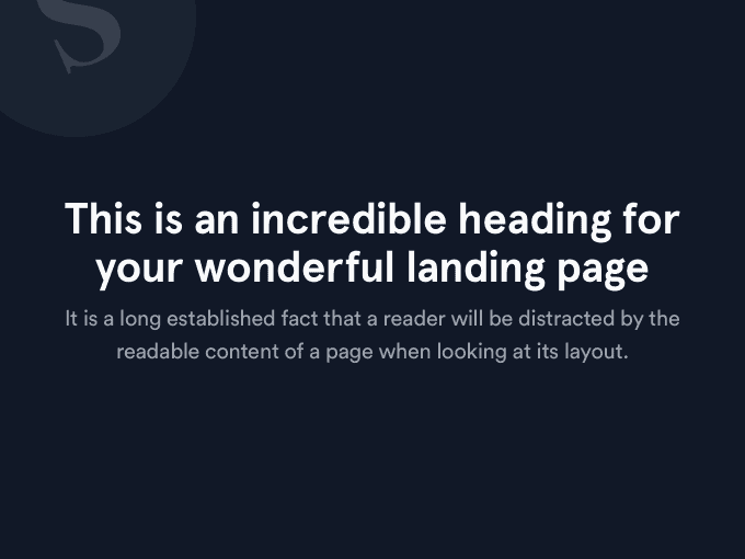
For this third and final “experiment,” we played with two San Serif fonts: Specifically, Apercu Pro for headings and Circular Std for paragraphs. We really like how these two typefaces work together, providing a clean and modern look for every occasion.
Conclusions
We hope you’ve enjoyed this article and gained some knowledge and ideas for choosing a font (or a combination of fonts) for your landing page. If you need further inspiration, we suggest taking a look at our gallery of landing page inspiration, where you can draw ideas from the hundreds of designs we have collected and categorised over the years.